Table of Contents
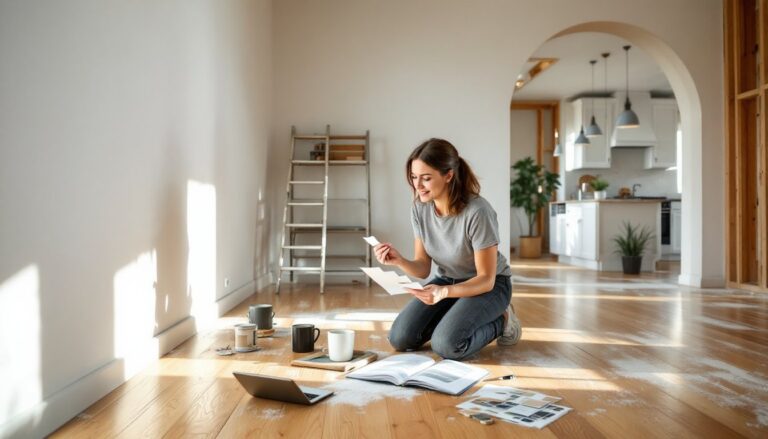
ToggleGlass-front upper cabinets can be a kitchen’s best feature, or its most chaotic eyesore. The difference comes down to intentional styling. Unlike solid doors that hide clutter, glass cabinets put everything on display, which means what’s inside becomes part of your kitchen’s design. Done right, they add depth, personality, and a custom look without a renovation. Done wrong, they broadcast mismatched mugs and half-empty cereal boxes to anyone who walks in. This guide walks through the practical steps to turn those transparent shelves into something worth looking at, using straightforward design principles and items most homeowners already own.
Key Takeaways
- Start by decluttering and curating items in your glass kitchen cabinets to display only what is regularly used, genuinely beautiful, or tells a story—keeping capacity at 60-70% to avoid a crowded appearance.
- Choose a consistent two to three color palette with neutral bases and strategic accent pieces to create visual harmony without clashing when styling upper glass cabinets.
- Layer items by varying heights, using odd-numbered groupings, and leaving 30-40% negative space on each shelf to achieve a curated, intentional look rather than an overstuffed display.
- Paint or add a contrasting backdrop color inside glass cabinets to add instant depth and make dishware pop, especially when using dark interiors to showcase lighter pieces.
- Install warm LED strip lights or puck lights under shelves to transform the visual impact of glass kitchen cabinets, making the display appear polished and professionally designed.
- Mix functional dinnerware with a few carefully chosen decorative items like potted herbs, cookbooks, or wooden cutting boards to add personality without creating a cluttered appearance.
Why Glass Cabinet Styling Matters More Than You Think
Glass cabinets weren’t originally a design statement, they were practical. Early kitchens used them to keep dust off dishes while allowing homeowners to see what they had. Today, they serve a different purpose: breaking up rows of solid cabinetry, adding visual lightness, and showcasing curated collections.
But visibility cuts both ways. A well-styled glass cabinet creates focal points and rhythm in a kitchen. It can make a small space feel more open or add contrast in an all-white layout. On the flip side, a cluttered cabinet drags down the whole room, no matter how expensive the countertops are.
The styling inside affects perceived home value, too. Real estate agents know that kitchens sell houses, and glass cabinets are one of the first things buyers notice during walkthroughs. Thoughtful displays signal a well-maintained home. Random stacks of Tupperware suggest deferred maintenance, even if that’s unfair.
This isn’t about perfection, it’s about intentionality. The goal is to create a display that looks cohesive at a glance, even if it’s not Instagram-ready under scrutiny.
Declutter and Curate: Start With a Clean Slate
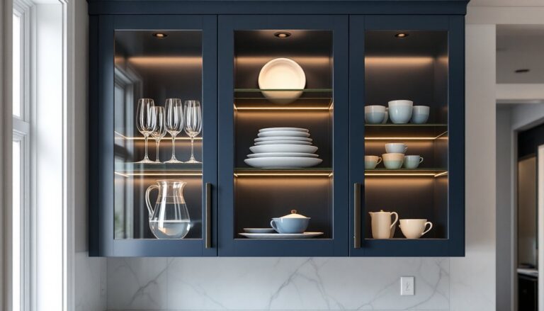
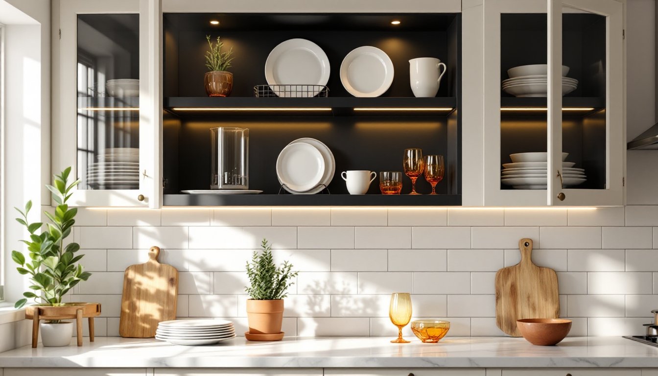
Before arranging anything, remove every item from the cabinets. Wipe down the shelves with a degreaser, kitchens accumulate a film of cooking oils that dulls glass and paint. If the cabinet interiors are unfinished wood or builder-grade white, consider painting them. A contrasting color like navy, charcoal, or even black adds instant depth and makes lighter dishware pop.
Now comes the hard part: editing. Most people own far more dishes and glassware than they need, and glass cabinets aren’t storage, they’re display cases. Sort items into three piles: everyday use, special occasion, and “why do we still have this.”
Keep only what fits one of these criteria: it’s used regularly, it’s genuinely beautiful, or it tells a story (heirloom pieces, travel souvenirs, handmade pottery). Everything else belongs in a closed cabinet, donated, or tossed. A good rule of thumb: if your glass cabinets hold more than 60-70% of their capacity, they’ll look crowded.
This is also the time to assess mismatched sets. Three random wine glasses from different decades won’t look curated, they’ll look like leftovers. If you don’t have cohesive sets, it’s worth investing in a few matching pieces. That doesn’t mean expensive: it means consistent in style, color, or material.
Choose a Color Palette and Stick to It
Professional designers limit glass cabinet contents to two or three colors max. This doesn’t mean everything has to match perfectly, but there should be a through-line. White dishes with blue accents and natural wood, for example. Or cream ceramics with brass and glass. The restriction creates harmony even when individual pieces are different.
Neutral bases work best, white, cream, gray, or natural materials like wood and rattan. These allow colorful accent pieces (a set of colored glassware, patterned bowls, or vintage tins) to stand out without clashing. If the kitchen already has a bold backsplash or colorful walls, keep cabinet contents mostly neutral to avoid visual competition.
Consider the cabinet’s backdrop color too. If you’ve painted the interior, choose dishware that contrasts with it. Dark interiors showcase white or light-colored pieces beautifully. Light interiors benefit from darker pottery, colored glass, or items with strong patterns.
Texture counts as much as color. Mixing matte ceramic, glossy glass, and raw wood within the same palette keeps things interesting without getting chaotic. Many homeowners find inspiration from kitchen design ideas that demonstrate how texture creates visual interest in small spaces.
Layer With Purpose: Height, Depth, and Visual Interest
Flat rows of same-height objects look institutional, like a cafeteria supply closet. Designers use layering to add dimension: varying heights, staggering depths, and creating small groupings rather than evenly spaced items.
Start with larger items in back, smaller in front, basic, but it works. Place dinner plates vertically on a small plate rack or lean them against the back wall. This shows off the plate design and uses vertical space efficiently. Stack bowls and smaller plates in front, but not too neatly: a slight offset looks more natural than a perfect stack.
Vary the height across each shelf. Pair tall items (vases, pitchers, bottles) with low items (bowls, small plants, stacked saucers). Odd-numbered groupings (three, five) feel more balanced than even numbers. If a shelf feels bottom-heavy, add a riser, a small wooden block, an upside-down bowl, or a purpose-made acrylic shelf, to lift some items and create levels.
Leave breathing room. Unlike closed storage, where you maximize every inch, glass cabinet styling needs negative space. Aim for about 30-40% of each shelf to remain empty. This prevents the “overstuffed” look and lets individual pieces stand out. Current home decor ideas emphasize this principle of intentional spacing to achieve a curated feel.
Mix Functional Items With Decorative Pieces
Glass cabinets don’t have to be purely decorative. The best displays mix everyday dishes with a few non-kitchen items that add personality, but don’t go overboard.
Functional staples that style well include:
- Glassware: wine glasses, vintage tumblers, or colored drinking glasses
- White or neutral dinnerware (the more uniform, the better)
- Ceramic bowls, especially handmade or textured pieces
- Pitchers, carafes, or teapots
- Cake stands or tiered serving pieces (add height and dimension)
Decorative additions that actually work:
- Small potted herbs or succulents (real or high-quality faux)
- Cookbooks stood upright with a bookend
- Vintage tins, canisters, or apothecary jars
- A framed small print or recipe card leaned against the back
- Wooden cutting boards or breadboards stood on edge
- Ceramic or brass figurines (use sparingly, one per cabinet, max)
Avoid anything that screams “filler”: fake fruit, overly seasonal decor, or random tchotchkes that have no connection to the kitchen. If it wouldn’t make sense to a stranger, it probably doesn’t belong. The goal is “collected over time,” not “raided a clearance aisle.”
Rotate items seasonally if desired, but keep the core palette and style consistent. Swapping in a few autumn-toned pieces or winter whites keeps the display fresh without requiring a full redesign.
Lighting and Backdrop Tricks to Enhance Your Display
Lighting transforms glass cabinets from “fine” to “wow.” If the cabinets don’t have built-in lighting, adding it is one of the highest-impact upgrades for the effort involved.
LED strip lights or puck lights are the most common solutions. Install them along the underside of each shelf, toward the front edge, so light washes down over the items below. Battery-operated versions work if running electrical isn’t an option, though hardwired or plug-in strips are more reliable long-term. Choose warm white (2700-3000K) for a cozy feel or neutral white (3500-4000K) for a crisper, more modern look. Avoid cool white, kitchens aren’t operating rooms.
For renters or anyone avoiding cabinet modifications, small clip-on LED spotlights or motion-activated tap lights stuck to the top interior can work in a pinch. They won’t be as seamless, but they’re removable.
Backdrop details matter too. If the cabinet backs are plain drywall, consider these upgrades:
- Paint: A bold or contrasting color adds instant polish.
- Wallpaper or contact paper: Peel-and-stick options make this a weekend project. Subtle patterns (linen texture, faux brick, geometric prints) add interest without overwhelming the contents.
- Beadboard paneling: Adds cottage or farmhouse charm. Cut to fit and attach with small nails or construction adhesive.
- Mirrored backing: Reflects light and makes small kitchens feel larger, though it also doubles the visual clutter, use only if the styling is tight.
Finally, keep the glass itself clean. Streaky, smudged glass kills the effect no matter how perfect the interior is. Wipe down both sides monthly with glass cleaner or a vinegar-water solution. For more comprehensive approaches to visual balance in home interiors, exploring furniture design strategies can offer additional perspective on layering and proportion.
Conclusion
Styling glass kitchen cabinets isn’t about perfection, it’s about making deliberate choices that suit the space and the homeowner’s actual life. Edit ruthlessly, pick a palette, layer thoughtfully, and don’t overthink it. The best displays look like they evolved naturally, not like they were staged for a photoshoot. Start with these principles, adjust based on what’s already owned, and remember that glass cabinets are meant to be lived with, not just looked at.